When you are ten years old and a girl and the year is 2000 and you enter a store like Maido, parents and other forms of chaperone do not get encoded into your memories. Adults are a mechanism you use to access such a wonderland, but within its magical borders they cease to exist. The interior of this haven brings you into your own little interiority.
Walls and shelves and cases of pastel notebooks, whimsical erasers in the shape of fruits, pens of every non-boring shade in the color spectrum. These are the reasons we would beg to visit San Francisco’s Japantown. These material artifacts of creation would point you to the invincibility of your own creative impulse. The mere suggestion of creative implements would rewrite you, in your own conception, as a supremely creative being. The possibilities: letters and sketches and drawings and paintings and collage and stickerings.
The adults in the room, in your consciousness, had vanished, but your friends hadn’t. They existed with you in this space whether they were physically there or not. They existed in the twinkle in your eye. You could get matching baby giraffe erasers. You could share a Badtz-Maru notebook. You could send them a letter covered in Pompompurin stickers. For a ’90s girl, the Japanese stationary store was not only a pilgrimage, but also a communion with friendship. Your interior was a shared space.
If the tools of creativity were going to be used towards expression, then the output would be too. This is how we all, simultaneously, came to aspire to a certain kind of handwriting. The form of the individual letters we wrote were a mode of self-conjuring on the page. Because we accessed the urge for creation collectively, our aspirations were communal as well. As girls, in that era, we were intentional about expressing our sameness.
My friends and I weren’t the kind of girls who would ever think of cheating—or, at least, I believed this to be true of all of us, in part because I believed that if a thing was true of one of us, it, by definition, also applied to the whole group—but we did learn each other’s handwriting by peeking at one another’s papers in class. The handwriting we were all aspiring to was Power Puff Girls as grapheme: bubbly, soft, ideally written in pink or blue gel pen, with your choice of heart, star, or jaunty bubble in place of the tittle on your j or i.
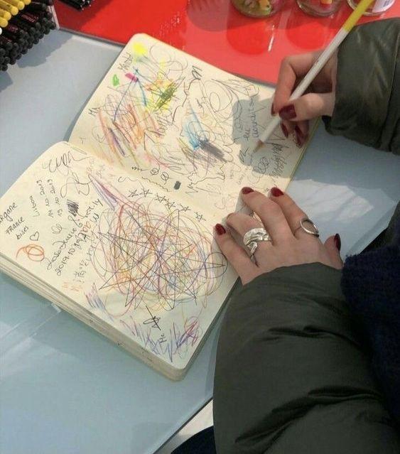
The pens we used to arc these curvy characters were branded as Gelly Roll, produced by the Sakura Color Products Corporation. Sakura was founded in Japan in the 1920s as a crayon manufacturer, but is best known for these pens, especially in the United States. The pens were invented in 1984, and came across the Pacific two years later—just a few years before my own birth––with the opening of a US headquarters in Hayward, CA, roughly 20 miles from the school building where my friends and I would use them to craft our shared identities.
Handwriting analysis is an early practice of criminology that sought to analyze someone’s personality and capacity for crime based on the way they write. It is an unabashed pseudoscience, but young girls in the ’90s, like us, were complicating this truth by making a definitive choice to let our handwriting be a manifestation of the personalities we were resolutely cultivating. Still, using our handwriting to try and solve an adolescent crime would have been pointless (not only because any kind of point was turned to stardust in our hands), but also because we were all donning the same disguise. The only thing more deliberate than our efforts to be more ourselves was our effort to make ourselves more like our friends’ selves. We were unstoppable, together. This was Girl Power; strength in unity, rather than in two biceps.
My particular group of gal pals learned each other’s handwriting in part through a secret notebook we kept. I can’t remember what exactly we wrote in this shared notebook, but I am sure it was filled with prosaic accounts of our daily adolescent lives, with little tidbits of tattle here and there. Regardless of the dearth of intrinsic value in this secret notebook, it meant the world to us. It was our treasure, and probably the only true secret we ever managed to really keep in all our time at school together.
We took extraordinary measures to keep the contents and the existence of this notebook classified. At least, extraordinary by the standards of young girls in the ’90s. This was a time before cell phones and finstas, so our mission required analog methods of concealment. It was important, if we were to keep our crown jewel sacred and protected from the prying eyes of teachers and social nemeses and brothers, that we keep its physical form and existence as secret as its contents. We devised what we considered to be an ingenious method for doing so.
On the outskirts of a courtyard on our school grounds sat a little bathroom that Big Kids (that being, us and our peers) never used. The mirror in this bathroom hid a medicine cabinet behind it, like in a residential building. Over the years, the cabinet had been glued shut through layers and layers of white paint adjoining the wooden frame of the old mirror with the wall beside it. I can’t recall what kind of tool we used, probably a butter knife, but we chipped away at the paint bit by bit until the mirror came loose from the wall and we were able to get inside the medicine cabinet. There, in the cavity behind the mirror, was where we hid our secret notebook.
Around the time that my friends and I first began wrapping our palms around crayons and markers and wielding their tips against the outlines of uppercase letters, the graphic designer Vincent Connare was releasing Comic Sans into the new digital world. Children of our generation were some of the first to move so quickly between composing letters in pencil and composing letters through type. Our hands flowed seamlessly from Gelly Pens across Sanrio branded notebooks to clicked keys on the OG iMac G3s. The blueberry, strawberry, tangerine, grape, or lime translucencies of their bodacious figures mirrored the Gelly colors we pulled from sparkly pen cases.
Comic Sans is by no means the most important font ever created, but it is certainly one of the most iconic. It is instantly recognizable to people who would otherwise only be able to name Times New Roman, if that. Over and over again, Comic Sans has been mocked and voted the worst font ever created. This idea that fonts can be ranked against one another points to a curious understanding of design, as if the conceptual output of a designed product can exist in a vacuum, without context towards its utility, the very thing that makes it design rather than art.
At the core of most disdain for Comic Sans is an objection to its juvenility. But we were juvenile. We wanted to be soft, accessible, kind, and clear. This was the utility of rounded letters. One could tuck saccharinity into their curves. We wanted to adorn our femininity in this softness, to hide our secrets in legibility. Because what good are secrets if they aren’t shared? We would type each other missives and leave them in folders hidden on school computers, just as we would hide our secret notebook. These notes had to be in Comic Sans because they were the closest approximation to what we were trying to do with our hands. It was the closest approximation of us.
What armor Comic Sans became. Through typed letters, through identical handwriting, we could gain anonymity from prying eyes. Of course, we all knew who was who, which of our friends had which thing to say. This anonymity gave us cover, under which we had more freedom to show our true selves.
A Do You Like Me letter was one of the more formulaic mediums in which we worked. But there was safety in the formula. “Do you like me? (Check yes or no)” we’d scrawl across the top of a blank page. Below would be two check boxes, one marked “yes” and one marked “no”, as advertised. It was simple, effective, lacking in ostentation. We were trying to exert control over the possible outcomes. The worst case scenario was readily imaginable, making courage easier to don. Taking the leap with the written word, rather than asking the big question on ICQ or, later, AIM (where there were no simple boxes to check for response, and thus could come with so much more lexical baggage), meant that you could still exert some of yourself into it. Your femininity could be demonstrated while you leaped off the cliff of infatuation. A last minute appeal to the one who might catch you.
It also opened the door to being seen. Yes, humiliation was certainly possible, but what if your crush said yes? Someone, maybe even the whole of your classroom, could bear witness to your desirability. What’s more, a no can be temporary. We knew this, because we had lived our whole short lives exposed to the fickle winds of young love. We knew that crushes came and went chaotically, like the paths of an Art Farm. A Do You Like Me letter was a provisional salve for the chaos. Passing one in class was a mode of claim staking. We were not in the business of stealing crushes from one another. Our friendships were more important than all that. The public passing of these letters gave clarity to the complex physics of who had a crush on whom. The clarity, in turn, enabled us to take the crushes seriously, to respect their hallowed boundaries. We would give up anything for our girls, even a marriage plot drafted secretly in our heads. These crushes, in any case, were less about the boys and more an exercise in sororal truss making.
The boys seemed unable to express their own personalities in this same way, making the whole endeavor towards perfect handwriting feel that much more feminine. ’90s girl femininity was determined, of course, by how contrary a thing was to the realm of the boys. Most of them simply hadn’t put in the time and effort to develop the same intricate motor skills we had. Probably, our crushes were as impressed with our handwriting skills as we were with their facility with Super Smash Bros. But this didn’t make any of it seem futile. We were crafting a girl’s version of what made a girl desirable. And we were girls, so our version was all that mattered. This was the hegemony of Girl Power.
Maybe it was wrong for us to keep secrets. Secrets were the domain of powerful men. Prime ministers, cabals, dictators, business executives, soccer coaches. Who were we to do the same as them?
That we continued to keep secrets anyways marked us. Some of the teachers would’ve thought us petty and feeble, maybe even mean in our worst moments. Some of our parents would’ve stewed over the amount of time we spent scuttlebutting together, time in which we could have been studying. Nevermind that we were learning—learning to navigate the social nuances of the world. In the future, it was these sorts of dynamics that would hold us back, rather than a lack of knowledge. We know plenty.
Nevermind, either, that the secrets we told didn’t come from a place of mean spirit, but out of a famish for attachment. We gossiped in order to establish and dictate a decorum. We whispered to try to keep one another safe. We also slung mud because it was fun. Because when the mud would dry out, it acted like an adhesive, keeping us together in a taut unit. Because if we presented as a united front, no one could single us out for the shortcomings of our thoughts, or our desires.
They taught us cursive in school. The letters were still round, but there was something off about them. Maybe they were too round? Cursive was soft, but it wasn’t welcoming. It was largely indecipherable, despite how strict it was. It also felt outdated. We much preferred the modernity of writing our names, maybe alongside our crushes names or our BFFs names, in big bubbly block letters. We would draw the outlines of each of these block letters large, often in all caps, with our smooth Gelly Rolls. These letters were loud and confident like we wanted to be. They were aesthetic kin with the ballooning track pants our heroes wore on MTV or VH1.
Cursive was anything but that. Cursive, forced upon us by adults breaking into the natural cadences of our young, full days. Cursive took us out of our collective reverie and into the realm of the competitive—grades and praise and personal advancement. It would remain in our lives mainly in signatures. Cursive was for checkbooks and contracts and other shades of the abyss of adulthood.
I was browsing the pen section in a stationary store in my city the other day when I noticed the Gelly Roll pens. Had they been here this whole time? Did they just disappear from my mind but not the shelves, or are they having a resurgence? I noticed a pack of Gelly Rolls in shades of gray, and considered purchasing them.
Before making the purchase, I decided to test out a Gelly Roll on the provided blank piece of paper. I scribbled simple words in purple ink. To my surprise, the pen isn’t as great as I remembered. It doesn’t seem to make my handwriting any neater or my hand any more comfortable than the boring pens I gravitate towards now, as the boring adult I am. I’m instantly reminded of how wet the ink comes out. So easy to smudge against the thumbless edge of your hand as you write. I will say, though, the Gelly Roll does allow for a certain je ne sais quoi of roundness. There will be no sharp edges on these Ts.
Ultimately, I opt for a black Le Pen, but my mind lingers with the Gelly Rolls. There is something inherently funny to me about the idea of buying a set of Gelly Roll pens in gray shades. It seems like the surest sign I have ever come across that millennials really are aging, seeking the material comforts of our youth with none of the juvenility, or joyousness. I would use these pens to write in a private journal that no one else will even attempt to read.