1. Why skulls?
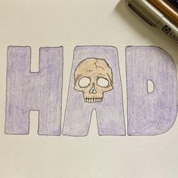
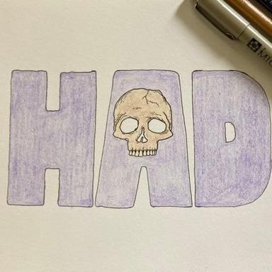
The short answer is cause they look cool. The longer answer is that in the last handful of years, I got pretty into metal. Especially going to shows, and I love the style of that over the top "death metal" style art. A few years ago I wanted to do some shirts for Hobart and I thought it'd be funny and rad to do "death metal"-style shirts for a lit journal so I asked one of my artist buddies to try and draw something for me. I love buffalo and they're kinda the unofficial animal of Hobart so my directions to him were basically just: a buffalo and a lot of skulls. So he drew that, it turned out great, and we had shirts. When Crow started mocking up the site and we were figuring out what it might look like, I was like, well, I have this Hobart death metal art that might be fun to play with. I might be misremembering, but I think to start with, the pile of skulls were just a placeholder. And an early idea was to probably have "HAD" above or behind or in front of them, or somewhere, but I think we both loved how the skulls by themselves looked and we kept coming back to paring everything back and making the site be as minimal as possible, which...
2. Why minimalism?
I'm not sure which came first but kinda the collision of two reasons: a) initially just for ease of building the site. Crow came on real early, and we seemed to have pretty similar tastes, and it really quickly became us going back and bouncing ideas off each other, but even before that, pretty much as soon as I had the idea for the site, part of my thinking was, if I find someone willing to help and build a website, how do I make it as easy and appealing for them as possible. And then, b) I just really loved (and miss) those early 2000s lit sites like elimae and eyeshot and Surgery of Modern Warfare, and they all basically looked like this, and so I wanted to kinda be in that lineage and pay homage while also feeling a little throwback-y.
3. You had a couple drinks. What were they?
Probably either a couple beers or a couple bourbons, probably mixed with either Coke Zero or ginger ale.
4. How do you choose the guest editors?
They're usually people who have been on the site and they have some mix of good, fun, and a little "chaotic" online energy, in ways that feel like a fit for the mag and also in ways that I feel like they can handle receiving and reading and responding to a couple hundred submissions in a day.
5. Do they pick the themes or do you?
They do. I sometimes give a little guidance tweaking or refining an idea but when we reach out and ask someone to guest edit, it is kinda then in their hands — theme or no, how many they can handle reading, how many they accept. Kinda all of it.
6. HAD started as something of a joke. What made it real?
Writers being so encouraging and enthusiastic and supportive of it. On Twitter, mostly, but not exclusively. So much of it was born from a place of entertaining myself and making myself laugh, and whatever seemed fun to both Crow and I, and pretty quickly this "what if...?" idea seemed to catch on and writers were really into the site and the project of it all, and not just the chaotic gamification of submitting, which is so much of it, but the writing people send us is AMAZING and people read it too, which is obviously the point of it all, but I think a lot of online publishing just kinda happens and it seems like, on top of all the dumb goofy fun on Twitter and all of that, people really read and respond to the pieces we publish.
7. What’s the weirdest cover letter you’ve received for HAD?
So many. This one is probably the most recent wild (and AMAZING) one:
8. Why do you think so many minimalist mags have gone defunct?
I don't think it's just minimalist mags. So many — most! — mags go defunct. They're a labor of love and they take a lot of time and energy and it is hard to sustain those, especially as life piles up.
9. Was spontaneity the plan all along, or did it come about…spontaneously?
That was always the plan. I started doing these occasional "I've had a couple of drinks, I am going to read submissions RIGHT NOW, for a short amount of time, and will respond ASAP" spontaneous calls for Hobart a few years ago and they seemed to go well the idea was just to build a whole site on that idea, and so the spontaneity was really baked into the journal from the beginning.
10. Do you have HAD ideas for themes kicking around for a while, or do they mostly pop up as…you know what would be funny?
Some of both. I have a couple of ideas bouncing around in the back of my mind but usually they pop up and if it seems fun and/or funny, I do it. :)
11. And now there is WAS? What’s that about?
Working with Crow on HAD was so fun, and we seemed to have a pretty great dynamic working on it together. And I'd always kinda liked the idea of having a sports-themed offshoot of Hobart, and we were maybe over-encouraged by the response to and goodwill for HAD that we fed that right into Words & Sports.
12. HAD’s vibe in six words or less?
Chaotic, fun, surprising, and great writing.
13. Any last words?
I don't think so. Thanks!!
View HAD on Chill Subs

